Overview
The AI Customer Agent SAAS Platform Redesign presented a unique challenge: transforming existing customer agent software from a functional but rudimentary state into a polished, user-friendly platform. Initially, the software lacked the necessary user experience (UX) and user interface (UI) design for widespread distribution. As a UX designer, my role was pivotal in elevating the platform’s usability, aesthetics, and overall appeal.
Tools
Figjam
Figma
Photoshop
Illustrator
Figjam
Figma
Photoshop
Illustrator
Project Goals
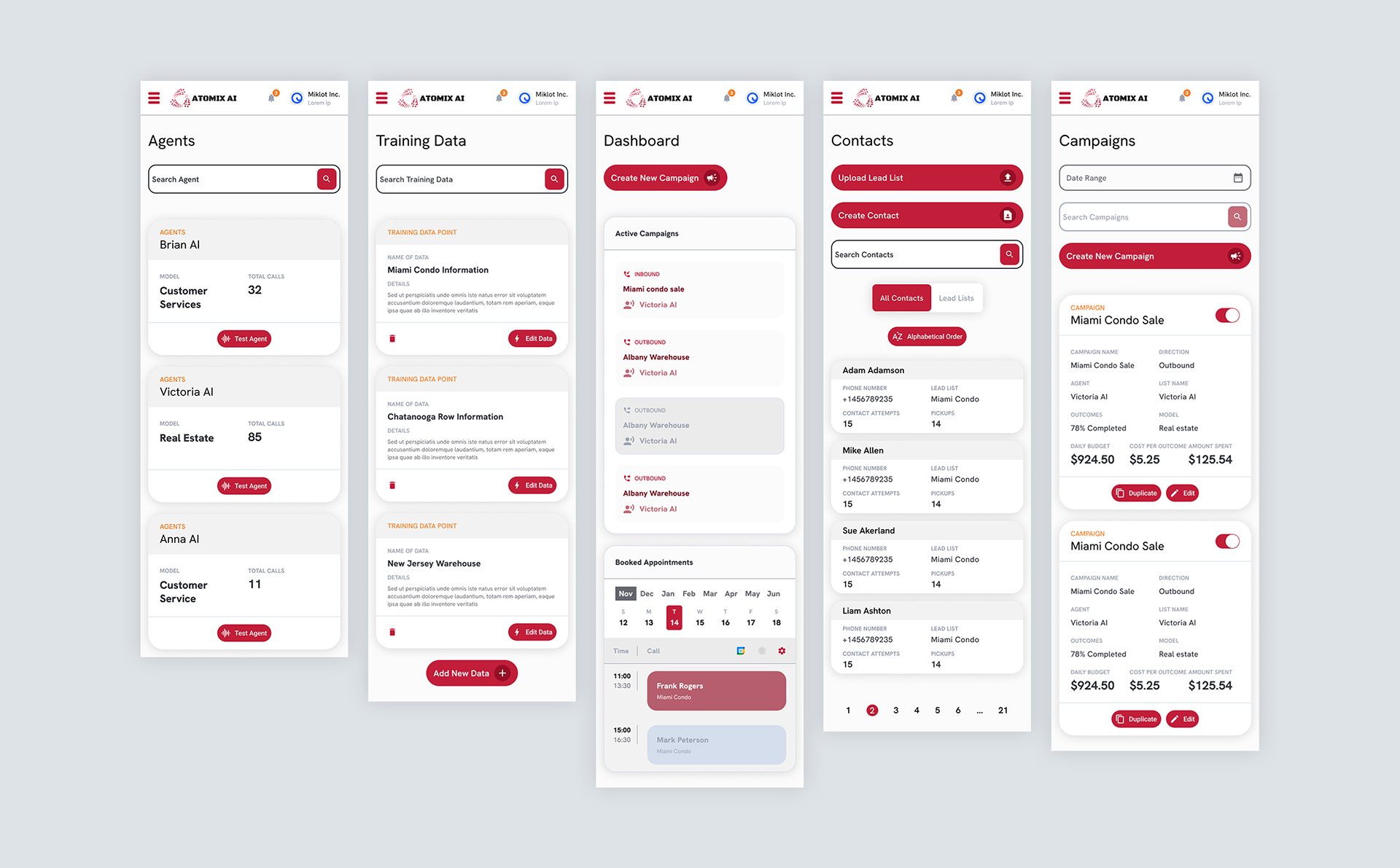
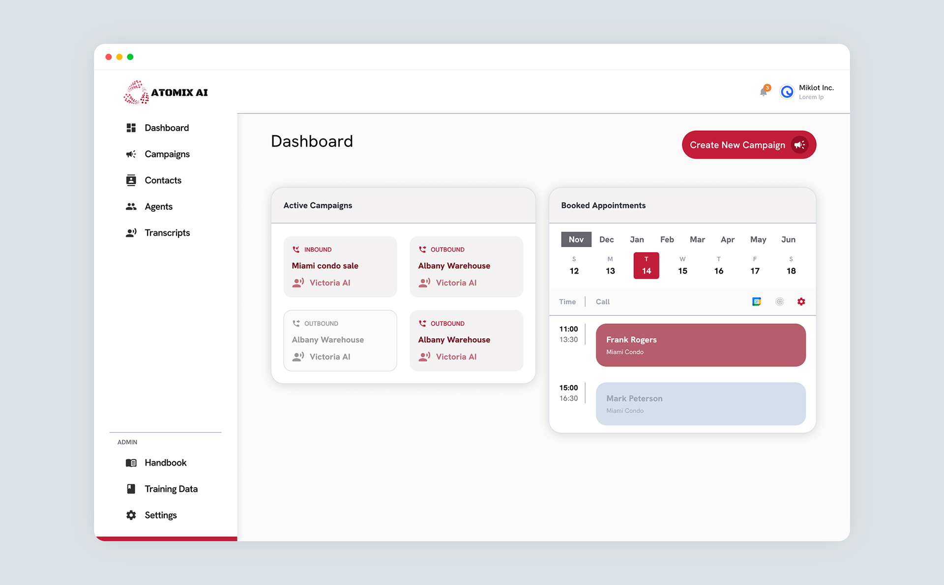
Enhanced Usability for Diverse Businesses: Our primary objective was to create an interface that seamlessly facilitated the training and selection of AI agents and plan and set inbound and outbound campaign calls across various industries. Whether it was real estate, retail, or tech support, businesses needed a tool that allowed them to manage client interactions efficiently.
Customization and Flexibility: Users should have the flexibility to choose their preferred agent voice and input information in various ways. Customizability was essential to accommodate diverse workflows.
Customization and Flexibility: Users should have the flexibility to choose their preferred agent voice and input information in various ways. Customizability was essential to accommodate diverse workflows.
Minimum Viable Product (MVP): Given budget constraints, we focused on essential improvements that would significantly enhance the platform without compromising its core functionality.
Research Goals
User Insights: We delved into the daily tasks, pain points, and expectations of professionals across different sectors. Their feedback guided our design decisions.
Benchmarking and Competitor Analysis: We studied existing customer agent platforms to identify gaps and opportunities for differentiation.
Limited Resources, Maximum Impact: Despite the lack of extensive resources, we aimed for substantial improvements within the MVP scope.
During the user research stage, I designed and distributed a survey to a group of business professionals on Reddit. In total, six participants responded within a day. My target audience consisted of individuals aged 25 to 60, both male and female, working in marketing or sales. To ensure relevance, I focused my analysis on four users who closely matched my intended user profile. This approach allowed me to gather valuable insights and tailor the redesign to their specific needs and preferences.
Design Problems
Functionality Over Form: The original software prioritized functionality but lacked a cohesive design. It was a raw canvas waiting for refinement.
Streamlining Data Entry: Balancing simplicity with comprehensive data input was crucial. We needed to make information entry efficient without overwhelming users.
Visual Transformation: The UI lacked visual appeal and consistency. Our challenge was to create an inviting interface that aligned with the brand.
Solutions
Customizable Templates: We introduced templates tailored to different call scenarios (lead generation, follow-ups). Users could adapt these templates to their specific needs.
Customizable Templates: We introduced templates tailored to different call scenarios (lead generation, follow-ups). Users could adapt these templates to their specific needs.
Voice Selection: Users gained the ability to choose from various agent voices, adding a personal touch to their interactions.
User-Centric Flow: We revamped the information input process, breaking it down into logical steps. Clear guidance and error prevention mechanisms improved efficiency.
Visual Refresh: The UI received a facelift, incorporating consistent branding elements, intuitive icons, and a clean layout.
Outcomes
Positive User Feedback: Early testers appreciated the improved usability and customization options.
Cost-Effective Enhancements: Despite budget limitations, we achieved significant improvements.
Setting the Stage for Growth: The MVP laid the foundation for future feature expansions.
Cost-Effective Enhancements: Despite budget limitations, we achieved significant improvements.
Setting the Stage for Growth: The MVP laid the foundation for future feature expansions.
The company is currently asking for funding to continue with the project, View the funding pitch.